How to Create a Power BI Dashboard: A Complete Guide by Knowledge Excel
Published June 12, 2025
At Knowledge Excel, we specialize in building professional, customized Power BI Dashboards that help organizations turn raw data into actionable insights. Whether you're a small business or a large enterprise, our expertise in Power BI empowers teams to make smarter, faster decisions with real-time visibility across key metrics.
In this in-depth guide, you'll learn how to create a Power BI Dashboard step by step—from data preparation to dashboard publishing—and how Knowledge Excel can help streamline the process for you.
1. What Is Power BI?
Power BI is a cloud-based business intelligence (BI) platform developed by Microsoft that empowers users to visualize data, uncover insights, and make data-driven decisions. Designed for both business analysts and non-technical users, Power BI simplifies data analysis by transforming complex datasets into interactive dashboards and compelling visual stories.
1.1 Introduction to Power BI: Evolution
Power BI originated from Microsoft's internal project code-named "Project Crescent," first revealed in July 2011 as part of SQL Server Reporting Services (SSRS). It officially launched as Power BI for Office 365 in 2014 and later evolved into a standalone service in 2015, gaining rapid popularity due to its ease of use, powerful integrations, and cost-effective licensing.
Since then, Microsoft has continuously improved Power BI by integrating AI capabilities, natural language queries, custom visuals, and advanced analytics—making it one of the most widely adopted BI tools in the world today.
As of 2025, Power BI leads the Gartner Magic Quadrant for Analytics and Business Intelligence Platforms—for the 17th consecutive year.
1.2 Why Power BI Stands Out
Unlike many traditional BI tools, Power BI combines user-friendly design with enterprise-grade scalability, making it ideal for startups and global corporations alike. Here's what sets it apart:
No coding required: Drag-and-drop interface for creating powerful visuals
Advanced analytics: Use DAX (Data Analysis Expressions) and Power Query M Language for custom measures and logic
Natural language queries: Ask questions like "What were sales last quarter in the US?" and get instant visual answers
AI-powered insights: Forecasting, anomaly detection, and cognitive services baked in.
Data connectivity: Connect to 100+ sources, including Excel, SQL Server, Azure, Google Analytics, Salesforce, and REST APIs
Enterprise security: Row-level security, Microsoft Azure Active Directory (AAD) integration, and compliance with standards like GDPR and HIPAA
1.3 Business Impact of Power BI
Power BI bridges the gap between raw data and business intelligence by:
Enabling real-time decision-making
Reducing dependency on IT for reports
Encouraging a data culture within organizations
AProviding executive-level visibility across departments
According to Microsoft, companies using Power BI have reported:
25% faster time to insights
30–40% improvement in reporting productivity
Significant cost savings compared to legacy BI solutions
2. What Is a Power BI Dashboard?
A Power BI Dashboard is a single-page, canvas-style view that displays key performance indicators (KPIs), trends, and metrics from various reports and datasets. It acts as a live snapshot of your business data, updating in real-time and enabling quick decision-making.
Key characteristics of a Power BI Dashboard:
Combines visuals (charts, graphs, KPIs) from multiple reports
Fully interactive: filter, drill-down, and slice data instantly
Web-based: viewable on any browser or mobile device
Real-time updates when connected to streaming data sources
Unlike a Power BI Report (which can have multiple pages), a dashboard is limited to one canvas page, but it can integrate content from multiple sources.
At Knowledge Excel, we design Power BI Dashboards that are not only beautiful but also deeply functional—customized to meet the real-time reporting needs of your business.
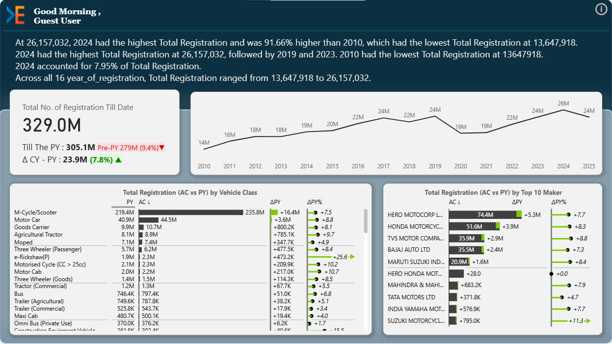
Dashboard showing sales performance metrics
2.1 Why Create Dashboards in Power BI?
Power BI dashboards enable businesses to turn complex, scattered data into a centralized, interactive visual experience. By connecting to a wide range of data sources—including Excel, SQL databases, CRMs, and cloud services—Power BI allows users to monitor key performance indicators (KPIs) and metrics in real time, all from one place.
Unlike static reports, Power BI dashboards are fully interactive. Users can filter, drill down, and explore data on their own, gaining deeper insights without needing technical expertise. This interactivity boosts engagement and helps teams across departments make faster, data-driven decisions.
Dashboards can be accessed via the Power BI Service from any browser or mobile device, ensuring insights are always within reach. You can also automate data refreshes, set alerts, and collaborate securely using Microsoft's enterprise-grade infrastructure.
Creating a dashboard in Power BI allows your team to:
View real-time metrics across multiple systems (ERP, CRM, Excel, databases)
Eliminate manual reporting
Enable collaboration via the Power BI Service
Customize visuals per department or role
Empower non-technical users to explore data
Power BI integrates with over 100+ data sources, making it ideal for businesses with complex data ecosystems.
Additional Benefits:
Secure Sharing with Microsoft Azure integration
Mobile-friendly dashboards
AI-powered analytics for predictive insights
2.2 Quick Steps: How to Create a Power BI Dashboard
Connect your data source (Excel, SQL, API)
Clean and transform data in Power Query
Build a data model with relationships and measures
Design visuals in Power BI Desktop
Publish to Power BI Service
Share and collaborate in real-time
3. Step-by-Step: How to Create a Power BI Dashboard
Creating a Power BI dashboard is not just a technical task—it's a strategic process. Each stage adds value to your data and contributes to the final insights you deliver. Below is a comprehensive, business-focused breakdown of each step:
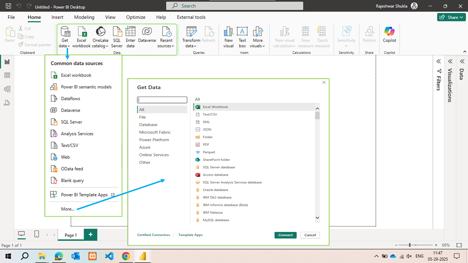
Data sources on Power BI desktop
Step 1: Connect and Prepare Your Data
Objective:
Identify and connect to the data sources that hold your most valuable business information.
Process:
Define which data sources are relevant: Excel files, SQL databases, APIs, SharePoint, cloud services like Google Analytics, Salesforce, etc.
Use Power BI's Get Data feature to make direct, live, or imported connections.
Perform data cleansing and shaping in Power Query—remove duplicates, standardize values, and filter irrelevant data.
Importing data for Power BI dashboard
Outcome:
A clean, reliable dataset that lays the foundation for accurate reporting and analysis.
At Knowledge Excel, we help organizations uncover hidden value by consolidating siloed data into a single source of truth.
Step 2: Import and Transform Data in Power BI Desktop
Objective:
Prepare your data for visual analysis.
Process:
Import data using Power BI Desktop.
Rename fields, apply formatting standards, and remove unused columns for performance optimization.
Apply data transformation logic such as pivoting, unpivoting, splitting columns, and creating new calculated fields.
Outcome:
An organized dataset that's consistent, user-friendly, and performance-read
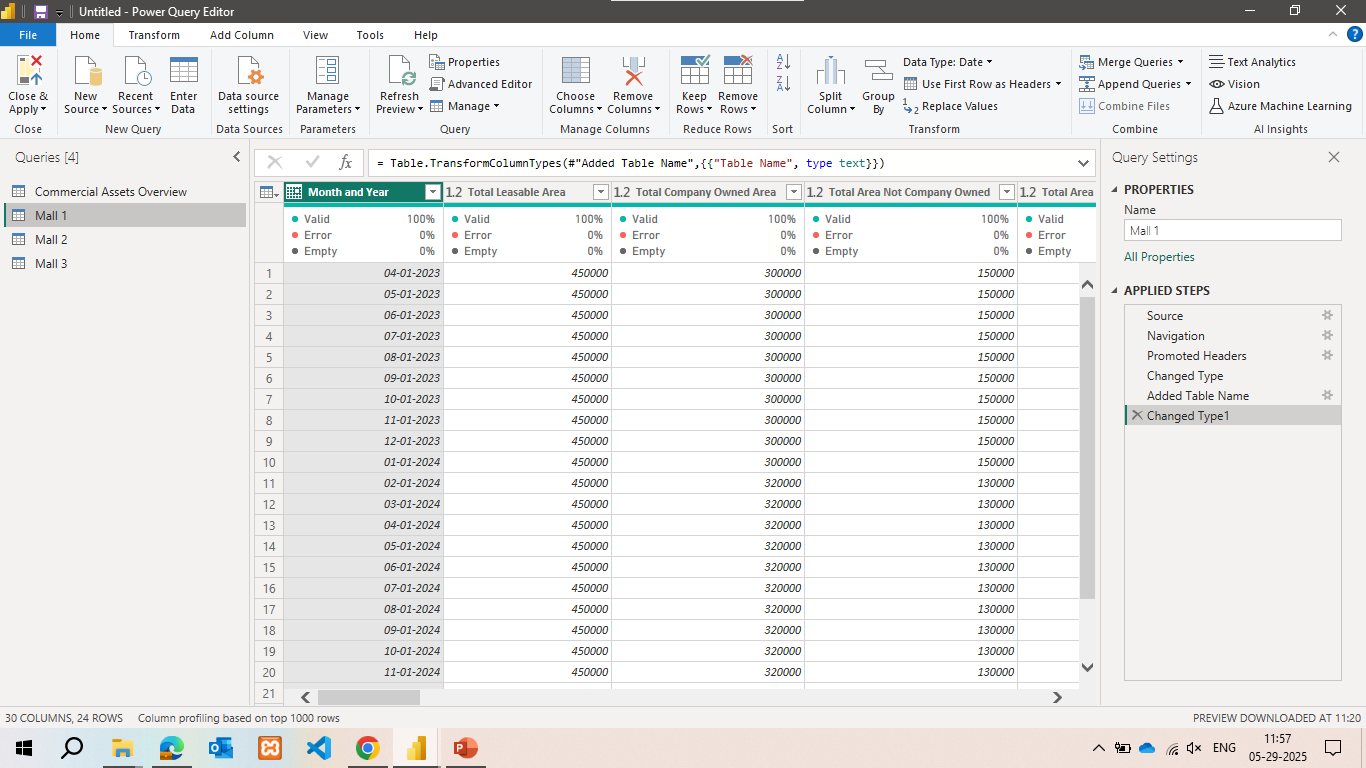
Data visualisation and filters on Power BI Query
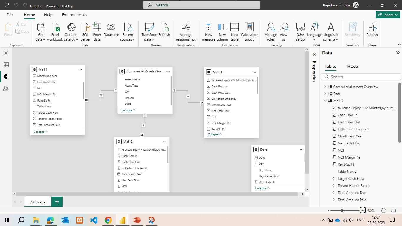
Step 3: Build Your Data Model
Objective:
Create logical relationships and calculations that power dynamic dashboards.
Process:
Define relationships between tables: one-to-many, many-to-one, and bidirectional filtering.
Use DAX (Data Analysis Expressions) to create calculated columns, custom measures, and KPIs.
Set up role-based access (Row-Level Security) if different users need different views.
Data table arrangements on Power BI
Outcome:
A robust semantic model that transforms raw data into meaningful, interconnected insights.
Step 4: Design Your Dashboard Visuals
Objective:
Build a compelling, intuitive dashboard that answers your business questions.
Process:
Choose the right visuals for each metric: line charts for trends, bar charts for comparisons, gauges for targets, and cards for high-level KPIs.
Incorporate interactivity with slicers, drill-throughs, and tooltips.
Apply your brand theme for fonts, colors, and layout consistency.
Organize the layout to reflect how stakeholders read data—KPIs on top, breakdowns below.
Sales performance metrics with Pie charts and trend lines
Outcome:
A dashboard that not only looks good but also drives clarity, focus, and action.
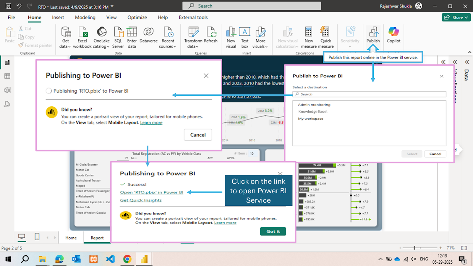
Step 5: Publish to Power BI Service
Objective:
Make your dashboard available to others in your organization securely and reliably.
Process:
Publish your Power BI file to the Power BI Service (app.powerbi.com).
Create dashboard tiles by pinning report visuals.
Organize dashboards in workspaces and apps for easy sharing and access control.
Add dashboards to Teams, SharePoint, or embed into your internal portal.
Report publishing on Power BI Service
Outcome:
Your dashboard becomes a living, shareable asset available to stakeholders anytime, anywhere.
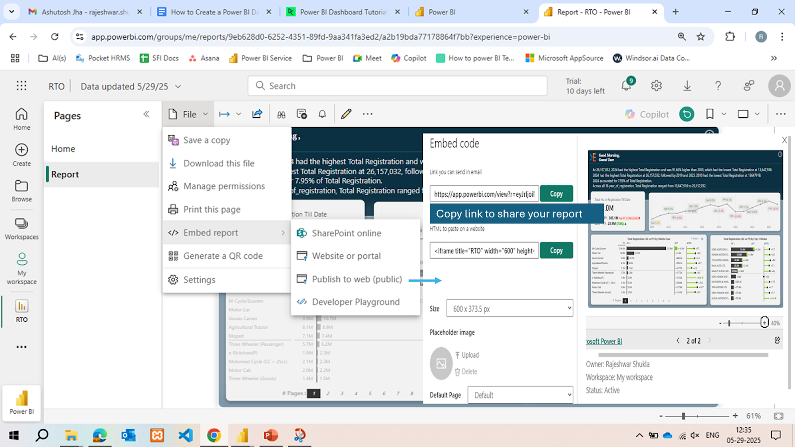
Step 6: Automate, Secure, and Share
Objective:
Keep your dashboards up to date, secure, and accessible to the right users.
Process:
Set automatic data refresh schedules—daily, hourly, or real-time using Power BI Gateway.
Implement row-level security (RLS) to control data visibility based on user roles.
Share via links, email, apps, or embed into websites with appropriate permissions.
Power BI Report sharing interface
Outcome:
An always-current, secure dashboard ecosystem that empowers real-time, data-driven decision-making.
4. Real Power BI Dashboard Examples (by Knowledge Excel)
We specialize in creating dashboards tailored to your industry, audience, and KPIs. Below are examples of dashboards we build for clients and their strategic applications.
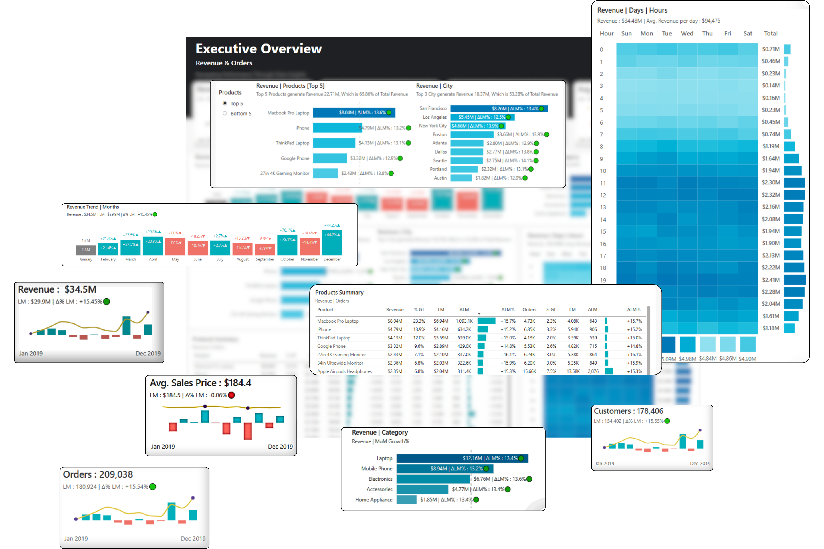
4.1 Executive Dashboard
Overview:
Gives top-level decision-makers a concise overview of business performance across departments.
Allows executives to monitor progress at a glance and pivot strategy in real-time.
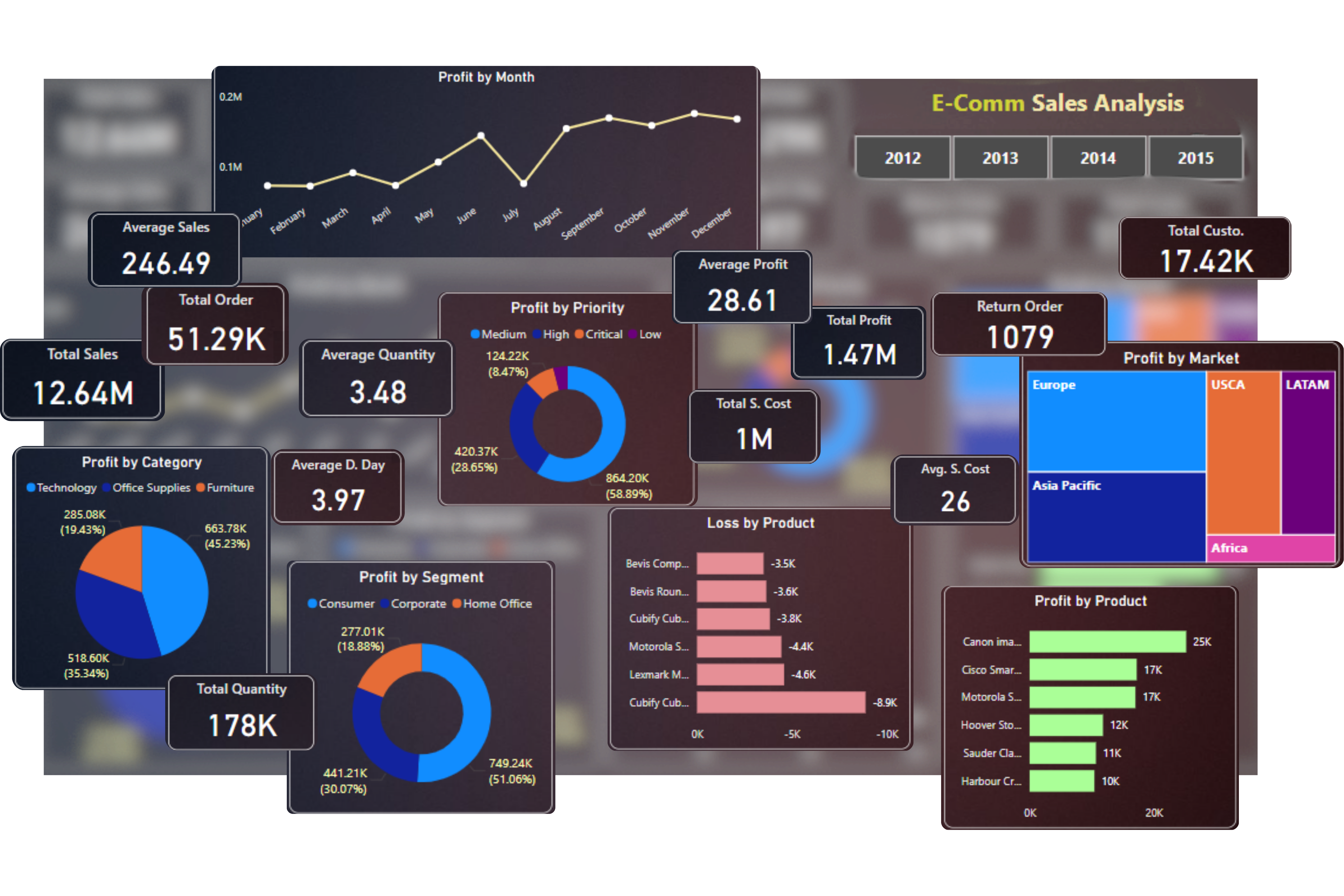
4.2 Sales Dashboard
Overview:
Tracks the entire sales lifecycle from leads to closed deals.
Sales Power BI Dashboard
Features:
Sales funnel visualization
Pipeline by rep, region, or product
Opportunity win/loss ratio
Sales cycle duration
Forecasting based on historical trends
Use Cases:
Daily performance checks by sales managers
Territory planning
Product focus shift based on pipeline strength
Benefits:
Increases visibility into sales performance and helps optimize conversion efforts.
4.3 Finance Dashboard
Overview:
Provides a snapshot of financial health and performance trends.
Finance Power BI Dashboard
Features:
Real-time Profit & Loss
Cash flow forecasting
Budget vs. actual variance analysis
AR/AP status
KPI alert thresholds (e.g., low liquidity)
Use Cases:
Monthly/quarterly closing reviews
Budget planning sessions
CFO dashboard drill-downs
Benefits:
Improves financial transparency and enables proactive fiscal management.
4.4 HR Dashboard
Overview:
Monitors workforce health and HR effectiveness.
HR Power BI Dashboard
Features:
Headcount and hiring trends
Attrition and retention metrics
Gender & diversity ratios
Performance review tracking
Leave and attendance trends
Use Cases:
HR executive updates
DEI compliance reports
Hiring strategy alignment
Benefits:
Supports data-informed HR decisions that improve retention and culture.
4.5 Dashboard Design Best Practices
We follow proven principles:
Minimalism: Clean layout with purposeful visuals.
Mobile optimization: Responsive layout on all screens
Visual hierarchy: KPIs at the top, drilldowns below
Consistent colors & fonts: Aligned with your brand
Accessible design: High-contrast, alt text, and tooltip guidance
Good design increases dashboard adoption and reduces confusion.
5. Common Challenges & How Knowledge Excel Solves Them
Challenge
Our Solution
Data in silos
Unified data model across multiple systems
Slow dashboard performance
Optimized DAX + data model tuning
Low user engagement
Role-specific design and training
Difficult refresh process
Automated scheduling with gateway setup
No in-house expertise
End-to-end consulting and support
6. Why Choose Knowledge Excel for Power BI Dashboards?
At Knowledge Excel, we bring not just technical expertise, but business intelligence strategy. Here’s why clients across industries choose us:
6.1 What Sets Us Apart
Business-First Design Strategy: We focus on how users actually consume data—not just how it looks.
Custom Solutions: Every dashboard is built to fit your KPIs, workflows, and audience.
Data Integration Experts: We connect and unify your data across all platforms—ERP, CRM, finance, marketing, HR, and more.
Ongoing Optimization: We don’t stop at delivery. We offer monitoring, performance tuning, and user training.
6.2 Our Services Include:
Dashboard development from scratch
Existing dashboard improvement and redesign
Data modeling and DAX optimization
Power BI training for teams
Gateway setup and data refresh automation
Embedded Power BI dashboards for web/apps
Our Power BI consultants serve clients across finance, retail, healthcare, manufacturing, and technology sectors.
Frequently Asked Questions
Power BI is Microsoft’s business intelligence tool used to create interactive dashboards. It streamlines Power BI reporting by transforming raw data into visual insights, helping businesses monitor key metrics effectively.
To create a Power BI dashboard, start in Power BI Desktop to build your report, then publish it to Power BI Service. From there, you can pin key visuals to a dashboard for a real-time, interactive reporting experience.
Yes. Sharing dashboards in Power BI Service requires a Power BI Pro or Power BI Professional license. This enables team collaboration, secure sharing, and scheduled data refresh features.
Yes, Power BI is designed for both technical and non-technical users. Its drag-and-drop interface allows anyone to create powerful Power BI dashboards and perform insightful reporting without writing code.
Power BI Consulting services, like those offered by Knowledge Excel, help businesses build effective data models, create customized dashboards, and optimize performance. These services ensure faster insights and better decision-making.

 Market Research SolutionsSmart technology with deep research expertise
 Power BI Dashboard SolutionTransform Data into Insights with Power BI Solutions
 Tableau Consulting ServicesInteractive Tableau dashboards for business insights
 Looker Consulting ServicesInteractive Looker Studio dashboards for data-driven insights
 Excel Consulting ServicesSmart Excel reporting, dashboards, and data automation.
 Survey ProgrammingRevolutionize your research with innovative solutions
 Global Data CollectionSeamless data collection from start to finish
 Data ManagementScalable solution for better decision making
 Data VisualizationUnlocking Business Insights with dashboards & simulators
 Research AnalysisUnlock transformative power of research analytics & insights
 Insign AIA managed DIY cloud-based platform for all your research needs
 Video & Text OpticsRevolutionizing market research interviews
 OptiminerConjoint & MaxDiff on steroids
 Data BoxOne-stop cloud-based solution for all research data needs
 ExcelwingsAutomate repetitive tasks & removes dependencies
 KE UnpluggedOffline surveys conducted on-premises
 Script BoxPlatform based repository for various custom scripts
 FeedForwardConduct survey on WhatsApp with ease
 BlogsRead latest blogs & trends for our resource hub
 Power BI Learn CenterMaster Power BI with expert tips, guides, and tutorials.
 ConjointUnderstand preferences through Conjoint analysis.
 MaxdiffOptimize decisions with MaxDiff analysis insights.